Introduction:
CIAO! is a pasta-to-go brand concept I created for the Instagram Weekly Brief Challenge, with the goal of developing a bold, expressive restaurant identity. Inspired by the rawness and honesty of Italians cooking at home, this concept embraces the joyful chaos of flavor-first food.
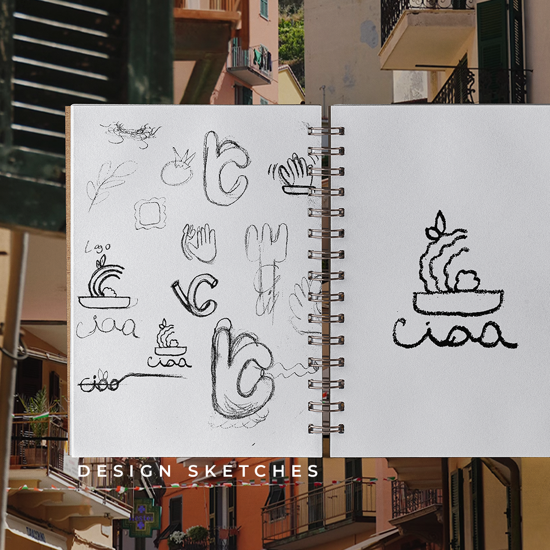
The logo design is built from the very elements of a great pasta dish: the shape of a basil leaf, a meatball, curled noodles, and the bowl that brings it all together. By reducing these to their most iconic forms, I created a custom mark that becomes the letter C in CIAO!—playful, abstract, and delicious by design.
This is what I created in just three days.
Mission:
Deliverables included logo design, packaging, social assets, and a loyalty card system—all created with a consistent, expressive language that reinforces brand recognition and fast-casual utility
Brand Voice:
Unfiltered. Modern. Bold. Youthful.
CIAO! speaks in the same tone it’s designed—fast, expressive, and full of flavor. The visuals are intentionally imperfect: thick lines, abstract forms, and high-contrast shapes that move with energy. It leans into a confident, youthful personality that doesn’t overthink, just acts. Whether it's packaging, signage, or social assets, the identity feels handcrafted and unapologetic—built for scrolls, shares, and standing out.
CIAO! speaks in the same tone it’s designed—fast, expressive, and full of flavor. The visuals are intentionally imperfect: thick lines, abstract forms, and high-contrast shapes that move with energy. It leans into a confident, youthful personality that doesn’t overthink, just acts. Whether it's packaging, signage, or social assets, the identity feels handcrafted and unapologetic—built for scrolls, shares, and standing out.